Making iOS 7 squircles using CSS3

View code Play Walkthrough

Experiments

Description

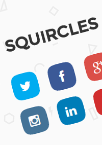
If you have noticed iOS 7 app icons, they are not normal squares with rounded corners. They are squircles which have properties of both a circle and a square.

This demo is an attempt to achieve a similar effect using CSS3. Pseudo elements are used to create 2 fish eye shapes which are later clipped to make the sides of the suqare a bit curved.

Add New Comment

8 Comments

(close)
Paul Radzkov

Paul Radzkov

Nice demo.

One improvement.
Use background: inherit to get rid of repeating when setting color.

.icons a:before,
.icons a:after {

background: inherit;

}

/*colors*/
.tw {background: #00ACF0;}
.fb {background: #3B5997;}
.gp {background: #DB4F48;}
.ig {background: #447397;}
.li {background: #007DB8;}
.yt {background: #D12E2E;}

Joshua Hutt

Joshua Hutt

You should consider adding this to the CSS for the icons, to eliminate the shifting effect in Chrome:

-webkit-backface-visibility: hidden;

Hope this helps!

Chris

Chris

Would it be possible to display a picture (e.g. user-avatar) instead of the basic background colors?

jabez128

jabez128

so impressive!!
expect much more good works!!

Sammy

Sammy

Is there any way for me to get icons for other websites too like Blogger for example?

Richard Mišenčík

Richard Mišenčík

What is it supposted to do? From border-radius it all looks the same, no changes.

 
<h1>Squircles</h1>
<div class="icons">
    <a href="#" class="tw"><i class="icon-twitter"></i></a>
    <a href="#" class="fb"><i class="icon-facebook"></i></a>
    <a href="#" class="gp"><i class="icon-google-plus"></i></a>
    <a href="#" class="ig"><i class="icon-instagram"></i></a>
    <a href="#" class="li"><i class="icon-linkedin"></i></a>
    <a href="#" class="yt"><i class="icon-youtube"></i></a>
</div>
 
/*Importing custom fonts*/
@import url(http://thecodeplayer.com/uploads/fonts/fontawesome/css/font-awesome.min.css);
@import url(http://fonts.googleapis.com/css?family=Montserrat);
 
/*basic reset*/
* {margin: 0; padding: 0;}
body {
    padding: 70px;
    background: url('http://thecodeplayer.com/uploads/media/geometry.png');
}
h1 {
    font-family: montserrat;
    color: #333;
    text-transform: uppercase;
    padding: 30px;
    text-align: center;
}
 
.icons {
    width: 220px;
    margin: 0 auto;
}
.icons i {
    display: block;
    font-size: 24px;
    line-height: 50px; width: 50px;
    text-align: center;
}
.icons a {
    text-decoration: none;
    color: white;
    display: inline-block;
    margin: 10px;
    border-radius: 12px;
    position: relative;
}
/*Now we will create fish-eye shapes using pseudo elements and clip them to add a curve to the sides of the icons*/
.icons a:before, .icons a:after {
    content: '';
    position: absolute; left: 0; top: 0;
    width: 100%; height: 100%;
    background: inherit;
    border-radius: 100%; /*circle*/
    /*time to transform the circle into fish-eye shape. iOS7 style now.*/
    transform: scaleX(2) scaleY(1.05);
    /*clipping the left and right sides - 17px from the left and right*/
    clip: rect(0, 33px, 50px, 17px);
    /*pushing it behind the icon*/
    z-index: -1;
}
/*duplicating the :before element and rotating it 90deg and swapping the X/Y transforms*/
.icons a:after {
    transform: scaleY(2) scaleX(1.05) rotate(90deg);
}
/*colors*/
.tw {background: #00ACF0;}
.fb {background: #3B5997;}
.gp {background: #DB4F48;}
.ig {background: #447397;}
.li {background: #007DB8;}
.yt {background: #D12E2E;}


5x 10x 15x 20x

8 Comments

Description